
Interior Paint Colors for Coastal Homes: Cape Cod Guide
· By Lucas Evangelista Rassilan
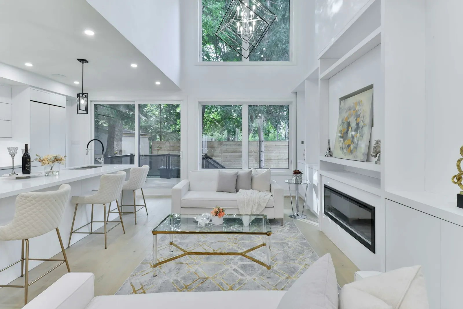
Picking interior paint colors for a coastal home is trickier than most homeowners expect. The light in houses along Cape Cod and the surrounding region is brighter and more reflective than in inland homes, and it shifts dramatically through the day as the sun moves over the water. A color that looked right on a chip at the paint store can read completely flat in a north-facing bedroom or overwhelmingly bright in a south-facing living room.
This guide covers the palettes that hold up best in coastal interiors, the right sheen for each room, and a practical method for testing samples before you commit. Whether you are refreshing a single room or repainting the whole house, the goal is color that looks right in real daylight, not just under store lighting.
Why Coastal Light Changes Everything
Natural light in coastal homes arrives at a different angle and intensity than most color guides assume. South-facing rooms with water views often get washed out by bright afternoon light, which can make saturated colors look faded and cool whites read as almost clinical. North-facing rooms tend to feel colder and darker, so warm-undertone colors hold up better there.
The key takeaway is that coastal light is not uniform across a house. A color you test in one room may look entirely different across the hall. This is why painting large sample boards and observing them through the day matters far more than picking from a two-inch chip at the store.
Soft Whites and Off-Whites That Work
Whites are the most popular interior color for coastal homes, and for good reason. They reflect light, make rooms feel larger, and pair with virtually any furniture or trim. The mistake most homeowners make is choosing a white that is too stark. Pure bright whites often read as cold or clinical, especially against the natural wood and shingle details common in Cape Cod interiors.
Off-whites with warm undertones, creamy whites, and soft linens hold up better. Look for whites with a yellow or beige base rather than a blue or green one. A warm off-white in a sunny living room reads as fresh and clean without feeling sterile, and in lower-light rooms it adds a welcoming softness. Warm whites also tend to age more gracefully in salt-air climates where cool-toned whites show wear more visibly.
Sea Glass, Sage, and Muted Blues
After whites, the most successful coastal palettes draw from the natural surroundings: soft aquas, sea glass greens, faded sage, and muted blues. These work because they echo what is already outside the window. Used well, they make interior spaces feel like a natural extension of the landscape rather than a contrast to it.
The important qualifier is muted. Bright turquoise or saturated teal can feel forced and date quickly. The colors that endure look almost like a neutral, with just enough color to register. Think of the green on a weathered lobster buoy, or the blue-grey of a foggy morning bay, rather than a postcard tropical ocean. Sea glass tones work well in bathrooms and bedrooms. Sage is versatile enough for living rooms and kitchens. Soft dusty blues can anchor a bedroom without feeling heavy.
Navy and Deep Accents
Deep navy earns its place in coastal interiors. Used on a single accent wall, the ceiling of a dining room, or in a home office, it adds depth and anchors a space without making a room feel closed in. The key with dark colors is proportion: an entire room painted navy can feel oppressive without plenty of natural light and high ceilings, but a navy accent wall or a moody powder room can feel intentional and polished.
Pair navy with warm whites, natural wood tones, and brass or matte black hardware for a look that holds up over time. Avoid combining it with pure bright whites, which tend to make the contrast feel harsh rather than refined. Deep charcoal and forest green follow the same rules and work equally well in the right spaces.
Sheen Choices by Room
Sheen matters as much as color and is often overlooked. For bedrooms and low-traffic rooms, a flat or matte finish hides surface irregularities and absorbs light rather than reflecting it, which creates a calm and restful feel. For living rooms and dining rooms, eggshell is the standard choice: low sheen, easy to clean, and forgiving on walls that are not perfectly smooth.
Hallways and kids' rooms benefit from a satin finish, which is more durable and easier to wipe down. Kitchens and bathrooms call for semi-gloss: it resists moisture, cleans easily, and holds up against steam and humidity. Trim, doors, and cabinets typically take semi-gloss or high-gloss, which gives them a crisp, finished edge against the wall color and helps them read as a distinct design element.
How to Test Samples Before You Commit
Paint large sample boards, at least 12 by 12 inches, and tape them directly to the wall. Look at them in the morning, at midday, and in the evening with the lights on. Colors with cool undertones can shift noticeably bluer in natural daylight and grayer under warm artificial light. Warm colors often look richer at night and softer during the day. Test two or three finalists side by side: the contrast on the wall will reveal differences that small chips never show.
The small extra cost of a few sample pots is nothing compared to repainting a room because the color did not read the way you expected. Once you have settled on a color and sheen, the quality of application matters just as much as the choice itself. If you are ready to move forward, Coastal Premium Painting offers free estimates with same-day response and no visit fee. Call (508) 299-9510 or use the contact form on this site to get started.
Frequently asked questions
- What is the best white paint for a coastal home interior?
- Look for whites with warm undertones rather than cool blue or green bases. Creamy whites and soft linens tend to hold up better in coastal light and feel less stark than pure bright whites. Test a large board in your actual room at different times of day before committing to a full wall.
- Should I use the same color throughout an open floor plan?
- Using one color across an open floor plan creates a cohesive, calm feel that works well in coastal homes where you want spaces to flow visually. If you want variation, keep it subtle: the same color family in slightly different tones, or a consistent trim color that ties the spaces together without feeling monotonous.
- How do I stop a color from looking too blue or too green once it is on the wall?
- Colors intensify when they go from a small chip to a full wall. What reads as a soft sage on the chip can register as a noticeable green in a large room. The fix is to test a large sample board (at least 12 by 12 inches) directly on the wall and observe it at multiple points through the day, not just in one light condition.
- What paint sheen is best for a bathroom?
- Semi-gloss is the standard choice for bathrooms. It resists moisture and steam, cleans easily, and holds up well over time. Flat or matte finishes are not a good fit for bathrooms because they absorb moisture and are much harder to clean. For a slightly softer look while keeping durability, some painters use satin on the walls and semi-gloss on trim and doors.
Related services
Found this helpful? Make us a preferred source on Google.
Ready for an exact price?
Get a free, no-pressure in-home estimate. Real numbers for your home, not a phone guess.